Pictures of spinal inflammation: a correlation kerfuffle
All the best pain nerds have been enthusiastically reporting the same thing in many different ways for many years (because the evidence for it is strong):
- what shows up on scans often does not explain pain
- what shows up on scans often does not explain pain
- what shows up on scans often does not explain pain
This is one of the science-based messages I’ve pushed hardest on PainScience.com over the years. It’s a good message, but it can be abused, like anything. Specifically, I think it’s increasingly abused by people with an agenda to say what does “explain pain.” And so there is always a need to encourage balance, nuance, and critical thinking.
Because imaging results have never been entirely useless, misleading, or unrelated to pain.
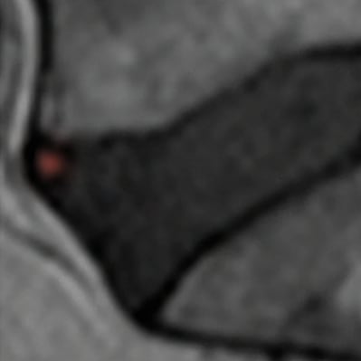
Just a little inflammation in an intervertebral disc. Doesn’t look like much, does it? But people who have this sign were in pain 3x more often in people without it.
Today I will describe some interesting new evidence that pain and imaging results probably can be meaningfully correlated, if you look for the right signs with the right tech. This doesn’t excuse disastrous overuse of imaging, which remains a clear and present danger. However, imaging is still evolving and improving, and this evidence suggests that, someday, we might have better imaging that can more reliably predict back pain. Asaf Klas Weisman on Sima et al:
“A new study finds evidence that High Intensity Zones on MRI, are correlated with pain and odds to be referred for an MRI. I think that we are slowly learning where to look to get the right answers for pain and correlation to structure. The notion that pain and imaging findings are not correlated is no longer tenable!”
The plain English summary
High intensity zones (HIZ) are bright blotches on certain kinds of MRI scans that show inflammation, often seen with more conventional signs of spinal disc changes.
How often, though? Sima et al. designed an experiment to shed light on that, and whether the HIZs have an “independent relationship” with other signs of degeneration (that is, do they go together regardless of other factors). They looked at the lumbar MRIs and X-rays of 136 adult patients, and found 57 (42%) had some HIZ (inflammation). They designated the remainder as a kind of control group, and crunched some comparison numbers.
HIZ spots were six times likelier in spines with other signs of troubled discs, and those patients were three times likelier to have pain than the no-HIZ folks.
Sima et al. concluded that standard signs of disc degeneration are “related” to scannable signs of inflammation, regardless of other factors, and therefore:
“HIZ is likely a symptomatic and clinically meaningful diagnostic tool in the assessment of low back pain.”
The word “likely” is doing quite a lot of heavy lifting there. 🙂 But it’s not crazy. I think this is a solid experiment. It’s limited by examining backs at only one moment in time; it can only say “these things were found together once” (cross-sectional) and not “the HIZ came before the symptoms and so the relationship is probably causal” (longitudinal). But it seems a sensible design for a mere slice-of-time study. Worse cross-sectional studies has been used to justify much more overstated conclusions.
Speaking of sensible: the inevitable and sensible criticism of correlation findings like this is that “correlation does not imply causation,” and that is absolutely technically true, and its importance should never be underestimated. This data alone definitely cannot and does not “prove” that the HIZ is a cause of back pain, or that scanning for HIZ is necessarily a useful clinical tool.
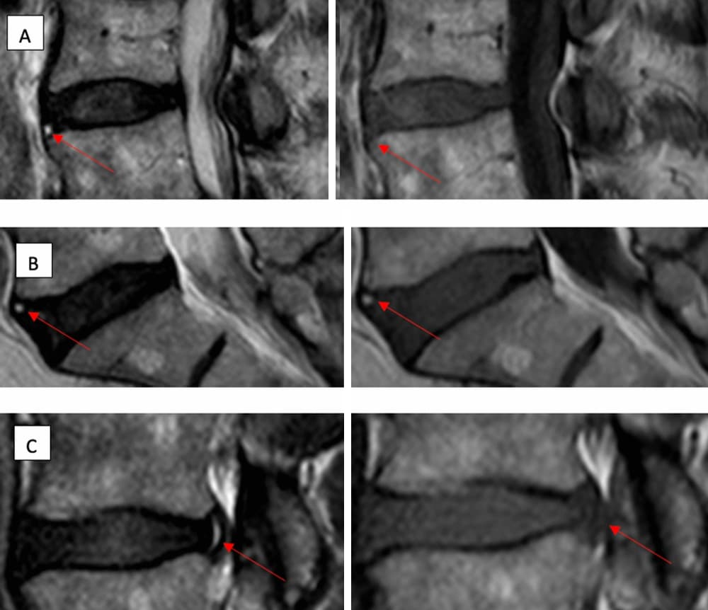
This isn’t exactly a great example of a picture being worth a thousand words — it’s complicated and subtle — but you can see some of those arrows pointing to more fuzzy white patches (no inflammation highlighting here). That’s the high-intensity zones, which is what inflammation looks like in an MRI scan.
What does it all mean?
This data alone “proves” nothing, but this data is not alone. And a causal relationship is hardly implausible. And the clear correlation “sure is a hint” (Tufte). Cross-sectional data is imperfect, but that doesn’t mean we just chuck it. This result is worth knowing about.
It’s not clinically useful today. But it is interesting to have a new data point that serves the broader point: back pain may be a function of many factors, many of them badly ignored, but inflammation is probably one of them, maybe a major one, and we can take a picture of it. Asaf again, from a discussion of this new evidence:
“…we have a workable paradigm … which is accepting systemic inflammatory processes as the culprit of ‘degenerative changes’ and that they are pro nociceptive. In this paradigm, chronic low back pain has nothing to do with mechanics but with a dysfunctional nociceptive apparatus.”
Dysfunctional nociceptive apparatus? That is, the pain system gets glitchy “because biochemistry.” Not structure. Not simplistic and minor biomechanical stresses. And probably not the mind either! As Ben Cormack put it recently, “The data is much better for poor health than ‘poor’ movement.”
Other relevant evidence
There are other papers showing similar things, and there has always been evidence that imaging results correlate to some degree with pain. Probably the best general example is a pair of 2015 papers by Brinjikji et al, one of them showing signs of spinal degeneration in many people with no problem at all … but the other showing that degenerative features visible on MRI are nevertheless there and much more in older adults with pain.
I can see how shocked you are. Take a moment, catch your breath.
So now with Sima et al we have some more and different evidence that back pain has a signature in the flesh, and it’s hardly the only example: it’s just a fresh one.
This all reminds me of the way pros and experts smugly dismiss something just because it isn’t obvious: Akshually, tendinitis isn’t “inflamed,” they’ve been saying for years, so it’s not really “itis”. Because chronic tendinopathy lacks conventional signs of acute inflammation and the tendons look more “degenerated” than inflamed. But when you look for subtler signs of inflammation, there they dang well are! See Dakin et al, or go read the first part of my guide to RSIs for the full story.
Yes, really, chronic tendinitis is inflamed! Another shock, I see. Glass of water?
Is this evidence “valuable”? Maybe, maybe not … but if you don’t think this stuff is interesting and worth discussing, I am not inviting you to the pub
When I shared my first reaction to Sima et al on social media last week, I called it “valuable” evidence — launching several arguments that smouldered for days. My use of the word “valuable” was too casual. I didn’t exactly sit there for ten minutes trying to decide exactly how valuable and why. I could have saved myself a lot of time if I'd just called it “interesting,” but “valuable” is what I said, and I can still get behind it.
It’s not crazy valuable. It is “mildly” valuable. Worth sharing. Gaining deeper insights into the nature of the beast is just an inherently good idea. It’s a contribution, another piece of the puzzle emphasizing that this particular pendulum belongs in the middle — not way over on either extreme. MRI has been grotesquely abused and overused, and structuralism remains hopelessly dominant in many ways, and I’ve been shouting that for twenty years.
But we’re also plagued by mind-over-pain empires that self-servingly over-interpret every scrap of evidence that imaging is not predictive of pain.
Both extremes exist, and they both suck.
And I this evidence suggests a refreshing alternative. I’d like to give the last word to Monica Noy, who defended its balancing value competently in one of those arguments:
It is reasonable to criticize this one study of course, but that doesn’t change its context within an already large and growing body of evidence that highlights improved sensitivity in imaging techniques that are revealing multiple different biomarkers associated with chronic pain. This has been going on at least as long as the biopsychosocial construct, but we’re seeing so much more of it now because the tech is better. Collectively these studies are showing us that we jumped the gun in thinking that having no otherwise explanatory findings meant there were no explanatory biological findings to be had. That does not change that the current models of medical and musculoskeletal practices are lacking comprehensive approaches to care, but it should put the brakes on some of the ideas about pain that are in popular circulation right now.
Could not have said it better myself. And indeed I did not! I just said, off the cuff, “valuable.” 😜